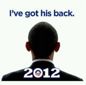
 I’ve seen this photo a couple of places. Ed Dunn at Dream and Hustle was the first person I saw to display it with the correct political line. But in general a number of my folks on Facebook have shared it without critique. It reflects a certain type of common sense. President Obama is under assault, particularly by conservative Republicans and Tea Party Independents (who, when they vote, vote overwhelmingly Republican). Indeed, his very legitimacy is being questioned. With 2012 on the horizon, and the very real threat of a Republican victory, Obama needs all the support he can get. We need to come to his aid. More to the point, we need to have his back. Folks sharing the picture read it as Obama standing between “us” and “them”, with “them” being an enormous Tea Party driven enemy. And they likely read it as Obama either leading us into the future or attempting to lead us into the future, only to be blocked. Indeed it brings to mind a 21st Century version of the Selma Bridge standoff.
The use of Ebonics here works to convey a sense of familiarity, to a certain extent modernity, and also intensity (“I support Obama” doesn’t have the same power as “I’ve got his back” does it?).
In 2008 Obama dragged presidential campaigns into the 21st Century. But this wasn’t simply a matter of him increasing donations through Facebook, or through his OFA group. This was also a matter of sampling liberally from 21st Century graphic designers, building an iconography that emphasized his larger than life presence. This image with its emphasis on Obama’s unique leadership, on his ability and willingness to fight for us even when assailed, works as part of a larger series of images.
But take a look at the following clip:
[youtube]http://www.youtube.com/watch?v=etEP1Bhgui0[/youtube]
After noting how much went into the logo design, contrast the ideas communicated by the logo against the ideas communicated by the photograph above. As opposed to “hope” and “unity” the picture above communicates divisiveness and fear. Granted, this is done in a uniquely “Obama” type of way. Yet and still the image above suggests a critical fight against a domestic enemy rather than an attempt to bring us all together to build a better world. Now don’t get it twisted. We DO face a domestic enemy. And that enemy does have something in common with the enemy demonstrators faced on that Selma bridge.
But particularly as Occupy forces gather at Wall Street and dozens of other cities across the world, I think I’d feel much better with iconography and more importantly rhetoric and action that suggested he had OUR back, rather than rhetoric that asks US to have his.
But as a leader, say perhaps like Dr. MLK, it’s already assumed that he obviously has our best intentions in mind. Like on that Selma bridge, MLK was in front, but it was understood that he had our backs.
I like how Obama and his supporters routinely use tactics perfected by the communist propaganda machines of the past. Don’t waste time on substance, achievements, or issues, instead distract with logos and iconography. Then demonize your opposition and assign them positions that they don’t actually support. Finally, convince people that you have their best interests in mind. To compare Obama and MLK in any fashion is an insult to the legacy of Dr. King.
I’ve Got his Back (WAAYYYY back) http://t.co/pidfOTKB